Tony Gondola:
That was going to be my next question. It's sometimes hard to tell because of processing but most wide field images of our own galaxy really don't have the vibrant blue we're talking about. I think most of us can agree that in a lot of cases, it's the processing, not nature. I think that changes my question a bit. If blue, how much. I suspect that in a realistic representation it really should just be a very light blue tint and not Las Vegas neon blue. Alan's M-31 is I think, closer to the truth.
I think your question opens a can of worms. Yet it is a logical question. Some of the questions raised in this thread have objective, definitive answers, even if those answers are still not completely resolved by the best of science. But the question of what the color
should be, as it relates to our astrophotography likely has no objective answer, even if parsed by science. The reason I say this is because we all work in visible light with our amateur gear. And if we are limiting ourselves to the visual spectrum, such as we are in this thread, then the fact is, none of these non-stellar objects show any color if we just look up at the sky. Even some of the largest telescopes that one can use for visual inspection can't gather enough light to excite our color sensing retinal cone cells. But I don't want to sound so negative, because our gear has the ability to act like much larger light buckets, such that they can deliver enough light to our
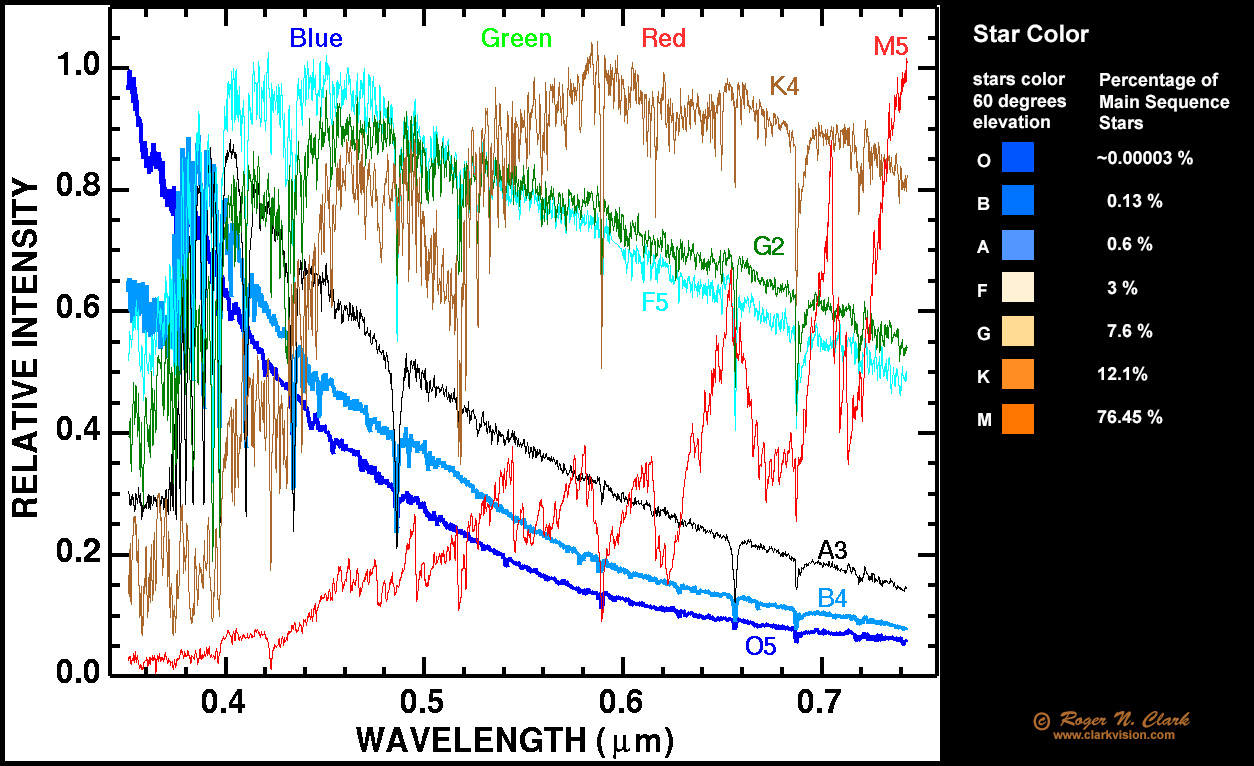
eyes/cameras to show us their color. However, how we represent that image is always couched in the qualifier as to how whatever technical assistance was use to present the image to the viewer. The best way to try to understand how astro colors really look to the human eye is to go to a Bortle one site when the Milky Way is high, especially the Sagittarius region. Look up first with naked eye and see the subtle colors. Yes the brightest closest stars are bright enough to see real color, but even these colors are muted when compared to what most star colors are presented here on AB. Then the star clouds can be seen and some of the brightest ones might show some slight differences in color (especially when viewed through binoculars), but only when in comparison to nearby other star clouds. Now imagine, you are hovering above the Milky Way in such a way that it looks when sized like M31 is usually presented by astrophotography. Under no circumstances will you see it in any way like any image of M31 that is presented here on AB. No HII region will be visible. Nor any of the other typical narrow band excitation regions, even though all of these narrow band lights fall squarely within our visual capability. At best, the nebulosity that will show up, is some of the reflection nebulae associated with the brightest nebulae, such as Orion and the Lagoon. The emission nebulae of these brightest nebulae only start to be seen in telescopes of decent size, and even those are still overwhelmed by the reflection components.
That said, for a balanced OSC or LRGB image of galaxies, they often show distinct color biases. And I believe that these are real. In contrast to the blue boosted images you see of M31, M33 appears to be truly blue in nature. It shows as such in almost all astrophotos (which is no objective measure). But I see the blue even before I start processing it. Objectively, M33 is known to be a relatively star-poor galaxy compared to M31. It is also a much more active star producing galaxy. I have read that it is likely producing stars at a relative rate much in excess of 5X that of the Milky Way and the Milky Way being even more active than M31. That means many more young stars/area and many more of these are blue and blue giants. So M33 has a reason for being so blue. It also has no central bulge, which would add more yellow/red stars to the body of the galaxy. M51 is also one that consistently is presented as strikingly blue and is nicely contrasted by its entangled partner, which is decidedly yellowish, thereby lending credence to the colors presented. Now, then, your question asks really, how should these examples (and all other galaxies) be presented by the author of the art? That is where the subjectivity imparts an endless spectrum of results, including color contrast, exact hue of the blue, etc. Lately, I have adopted using SPCC in PixInsight to let the color be what it is. I also have used either no color saturation or very light on the touch. I think most people here would consider my presentations to be rather dull because of this. And that suits me just fine. If my red stars are a believable red, and my blue stars are a ..., and so on then I am happy that the galaxy looks as it does. If I have to differentially color saturate my galaxy from my stars to make the galaxy look like everyone elses, then I know that I am working in a space I choose not to. At least of the present moment. I like what others do here, so I have no problem when I see pumped up the color in all of this stuff. I do what I do for my own purposes.