AmyWarble avatar
https://www.astrobin.com/2b9kw9/

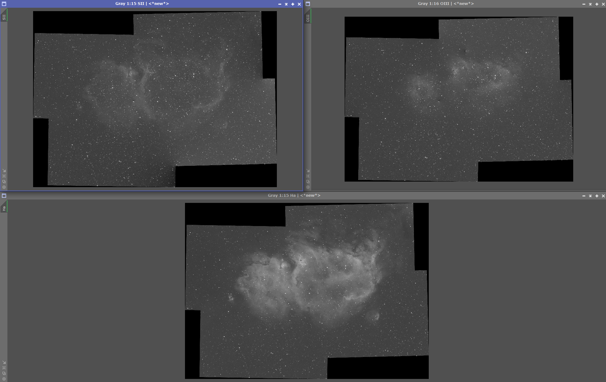
Please reference the above astrobin link. 

My process is under the image but I'll reproduce it here:
  • WBPP for each panel
  • ChannelCombination each panel -> HSO palette
  • MosaicByCoordinates
  • GradientMergeMosaic -> RGB image
  • DynamicCrop
  • GraXpert
  • SCT + HistogramTransformation
  • StarXterminator -> process stars separately
  • Nebula:
    • Curves
    • BlurXterminator
    • NoiseXtermator
    • Stars:
      • NoiseXTerminator
      • Curves

    • ImageBlend

I think I am under-exposing my OIII and SII channels relative to Ha.  What do you think?  How can I take this image to the next level?
Emmanuel Valin avatar
Before combination, apply LinearFit to the Ha and Sii using Oiii as reference.

You could also try to combine in non-linear mode, after stretching.

I recommend this reference: https://www.astro-photographie.fr/wa_res/files/SHO1-Simplified_processing_of_SHO_monochrome_images_with_SHO_stars.png?t=
Die Launische Diva avatar
The stars (some of them at least) have strange shapes. Their core brightness don't not blend well with the overall brightness of the nebulae. All of them are dull in terms of brightness. This is something we often see when people work with stars separately.

There is lack of color diversity; it is almost a duotone image with too much contrast and saturation.

The png format isn't appropriate for photographs; it is better suited for graphics/plots/logos/icons. And maybe the image needs to be downsampled as there is not enough detail to show at that high resolution.
AmyWarble avatar
Thanks for the feedback.  I'll try to put these suggestions into practice.
Well Written Respectful
AmyWarble avatar
Die Launische Diva:
The stars (some of them at least) have strange shapes. Their core brightness don't not blend well with the overall brightness of the nebulae. All of them are dull in terms of brightness. This is something we often see when people work with stars separately.

There is lack of color diversity; it is almost a duotone image with too much contrast and saturation.

The png format isn't appropriate for photographs; it is better suited for graphics/plots/logos/icons. And maybe the image needs to be downsampled as there is not enough detail to show at that high resolution.

What is the appropriate format that I should be using?  Astrobin tells me TIFF support is experimental. 

I have updated my image.  https://app.astrobin.com/i/2b9kw9?r=B
  • I worked on my stars, they should be better.
  • Color diversity should be better.  I used NarrowbandNormalization and adjusted the sliders till I was happy.
  • I tried using GHS this time.