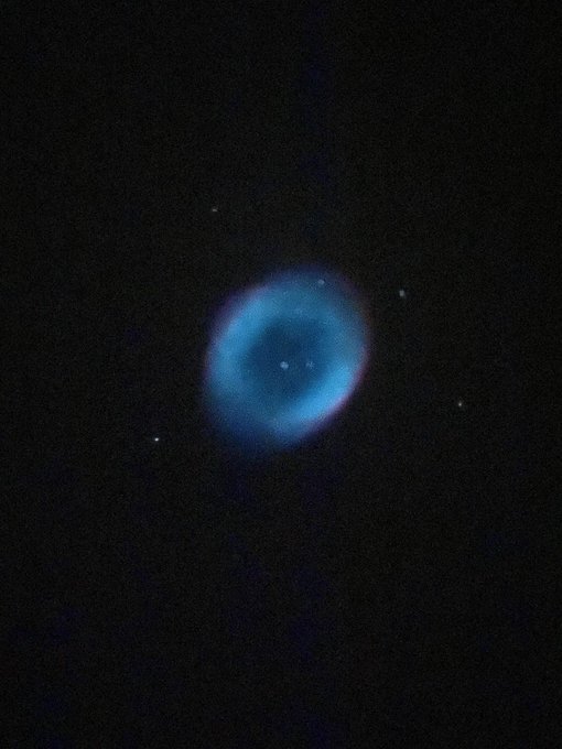
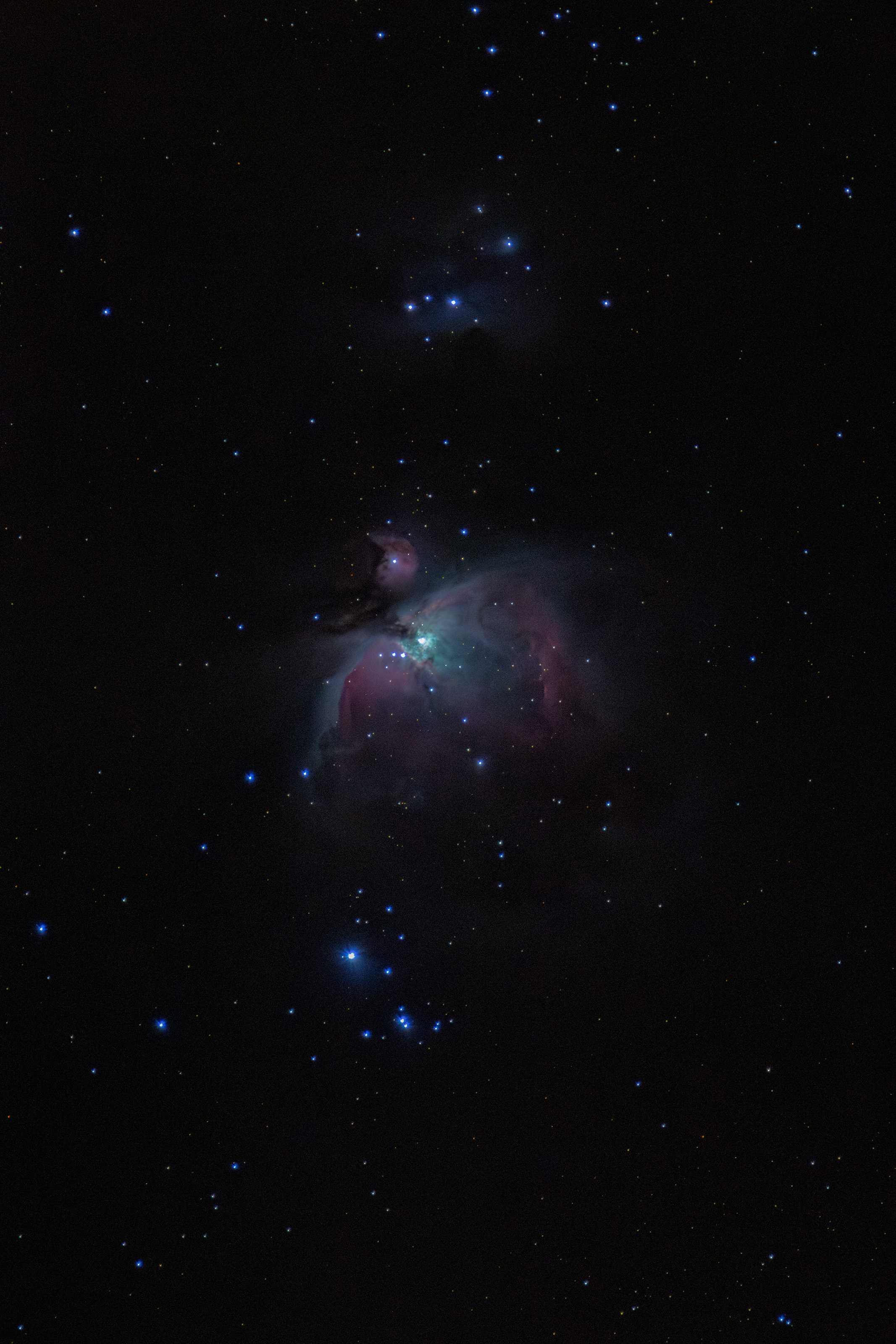
When imaging a 'pure' OIII target (so no Hubble palettes etc, but for example Planetary or HO nebula), what is the 'real' colour of the OIII signal?
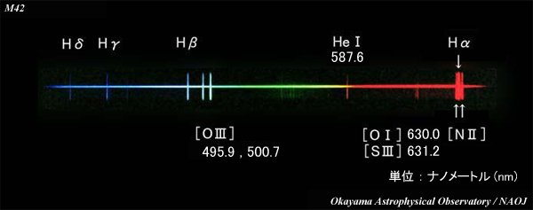
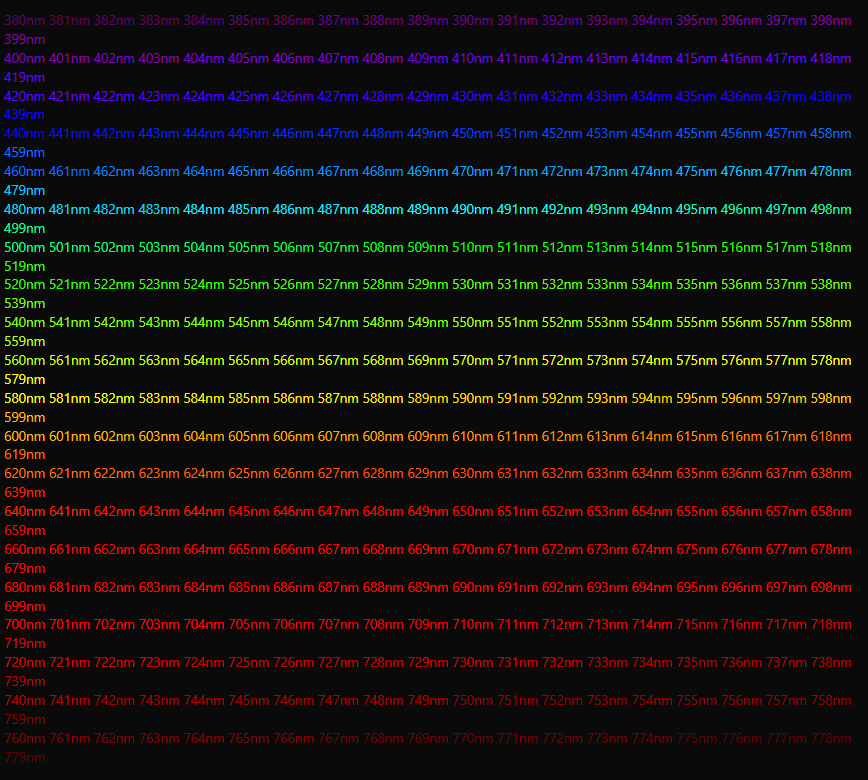
The OIII wavelength is 500.7nm. It is difficult to correlate wavelengths to an RGB image on our screen. But estimates in the mid-range of the spectrum should be fairly accurate. When using tools like this, or this, 500.7nm translates to a hue of 152 and 160 respectively. These are green colours.
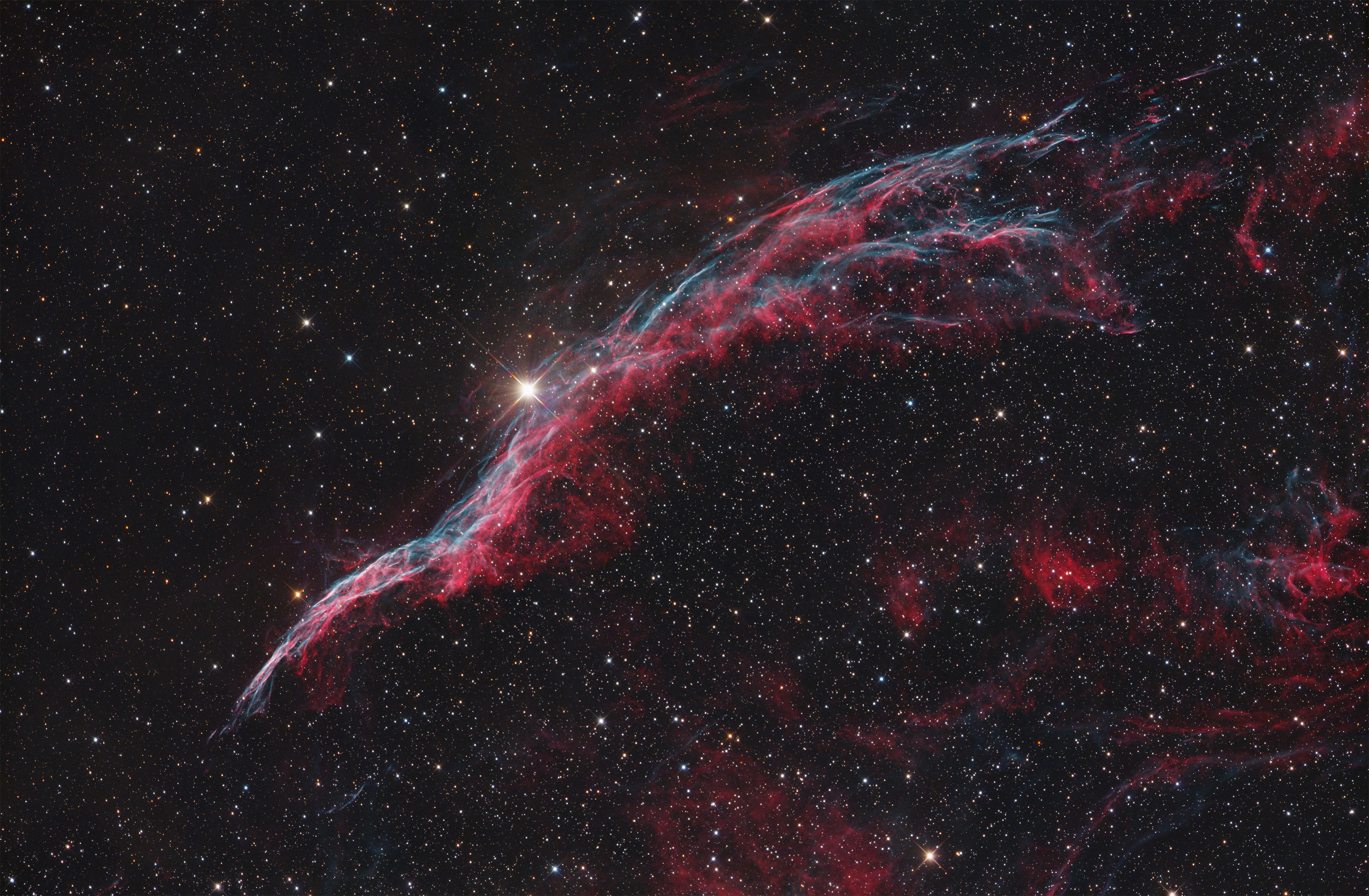
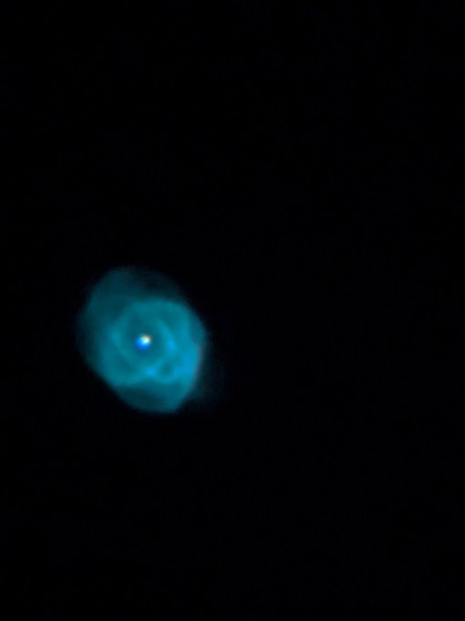
Often people refer to OIII as cyan or turquoise (according to Pantone very close to cyan, just must less saturated). Their hue is 176-180. Quite a bit more blue.
And in practise, it is very tempting to apply NBnormalisation and boost the OIII colours to a nice blue. I certainly do this.
Generally my impression is that for these targets, the general trend is to make them a lot more blue than they actually are. What are the thoughts here on this forum?
Should we make these targets a bit closer to their actual colour (i.e. make them a bit more green)?
Should we stick a bit more to the well known SHO palette and think of OIII as a blue colour?
Should we stay somewhat in between those and go for the turquoise?
An easy way to think of it is: none of what we image has 'real' colours anyway, so whatever you like most is the way to go....
But until a few days ago I was under the impression that OIII was turquoise/blue-ish, and it was only until I started playing with hue values in the NBColourMapper script that I realised that OIII is pretty green.
Just interested in people's opinions.
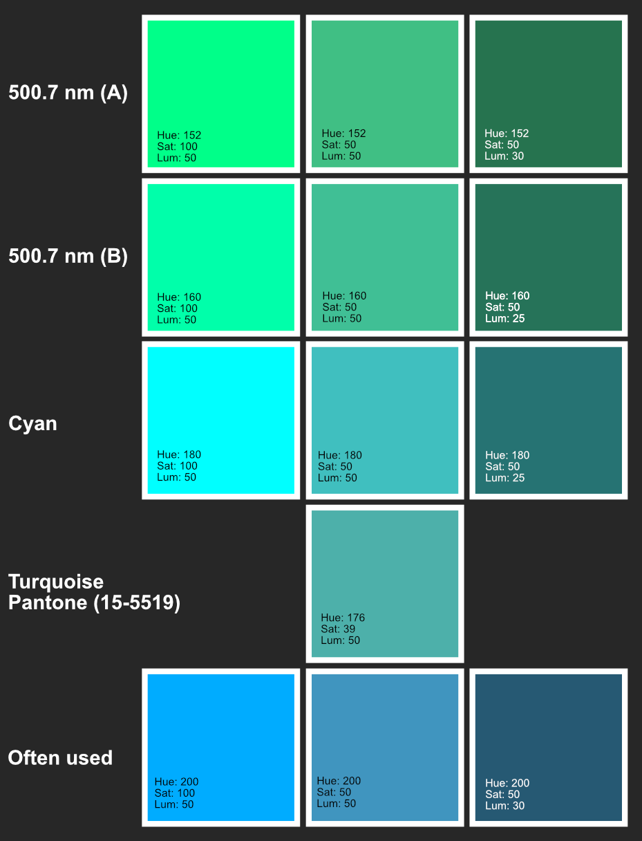
The OIII wavelength is 500.7nm. It is difficult to correlate wavelengths to an RGB image on our screen. But estimates in the mid-range of the spectrum should be fairly accurate. When using tools like this, or this, 500.7nm translates to a hue of 152 and 160 respectively. These are green colours.
Often people refer to OIII as cyan or turquoise (according to Pantone very close to cyan, just must less saturated). Their hue is 176-180. Quite a bit more blue.
And in practise, it is very tempting to apply NBnormalisation and boost the OIII colours to a nice blue. I certainly do this.
Generally my impression is that for these targets, the general trend is to make them a lot more blue than they actually are. What are the thoughts here on this forum?
Should we make these targets a bit closer to their actual colour (i.e. make them a bit more green)?
Should we stick a bit more to the well known SHO palette and think of OIII as a blue colour?
Should we stay somewhat in between those and go for the turquoise?
An easy way to think of it is: none of what we image has 'real' colours anyway, so whatever you like most is the way to go....
But until a few days ago I was under the impression that OIII was turquoise/blue-ish, and it was only until I started playing with hue values in the NBColourMapper script that I realised that OIII is pretty green.
Just interested in people's opinions.